Skip to main content
United States
Jump To
Support
Register or Log In
Support
Register or Log In
Instructors
Browse Products
Getting Started
Students
Browse Products
Getting Started
Home
>
ARCapalooza
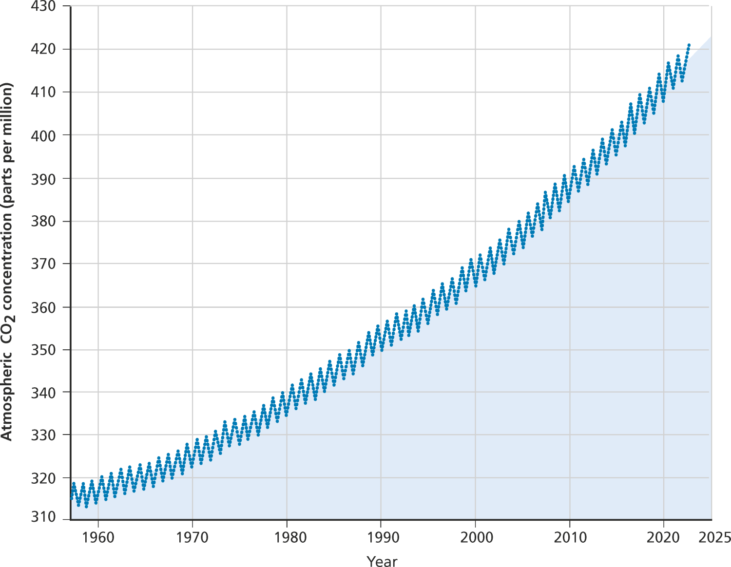
Short 3e, Figure 4.3: the Keeling Curve
Back to top
Printed from , all rights reserved. © Oxford University Press, 2024
Select your Country